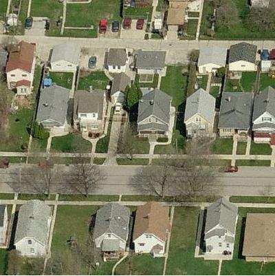
Bird’s Eye View Contest
Last week’s contest was won milwhcky, with an assist from Roger Rabbit. It was Sammamish.
This week’s is related to something in the news from August, good luck!
Last week’s contest was #200, so here’s the winner tally from the last 100 contests (the winners from the first 100 were announced here). Everyone with more than 1 win is listed. Contests can have multiple winners, so the total will be over 100:
wes.in.wa – 24
milwhcky – 16
Liberal Scientist – 11
Brian – 5
Siberian Dog – 4
Darryl – 3
Poster Child – 3
waguy – 3
Deathfrogg – 2
Blue John – 2
Geoduck – 2
Coosboy – 2
Budget Wonk – 2
Roger Rabbit – 2
2cents – 2
Luigi Giovanni – 2
uptown – 2
16 people won 1 contest
Thanks for playing!
HA Bible Study
Isaiah 28:2
Only the Lord is strong
and powerful!
His mighty hand
will strike them down
with the force of a hailstorm
or a mighty whirlwind
or an overwhelming flood.
Discuss.
Friday Night Multimedia Extravaganza!
Sam Seder and Ari Berman: Fighting back against Republican led voter suppression efforts.
Willard!
- Roy Zimmerman: Vote Republican—Vermont edition
- Ed: The Latino Etch-A-Sketch, or Romney tries for the Latino vote.
- Mitt Romney on Bain job creation.:
- Zina Saunders: Paul Ryan’s Scouts Honor
- Sam Seder: Why won’t Mitt release his taxes?
- America doesn’t need a Birfer-in-chief.
- Jenn: Mitt Romney has taken the Birfer plunge
- Maddow: Blacks, Hispanics apparently not part of Romney victory plan
- CNN factchecks Romney “welfare” ad: FALSE!
- Young Turks: Mitt Romney’s “energy plan”.
- Maher and Huffington on Paul Ryan.
- Pap: Bain Capital’s Central American blood money.
- The Romney Bunch
- Jonathan Mann: Ultimate Any Rand Porn.
- Young Turks: Mitt goes Birfer.
- Sam Seder: Gawker releases Bain documents before RNC, Romney prays for hurricane.
- Music Video: Full of Mitt:
- Martin Bashir: Why Mitt has 0% Black support.
- Maddow: Romney, Ryan haunted by extremist record.
- Young Turks: Did David Koch buy Ryan a VP slot?
Kimmel: This week in unnecessary censorship.
Obama: They drove the economy into a ditch.
Thom with even more Good, Bad, and Very, Very Ugly.
White House: West Wing Week.
The G.O.P. Convention:
- Grindr for the G.O.P. convention.
- Thom: Why belong to a party that doesn’t want you?
- Ann Telnaes: The abortion issue heading for the G.O.P. convention.
- Young Turks: Limbaugh suggests Obama “hopeful” hurricane will hit convention.
- Susie Sampson asks Stephen Colbert: Can I be your date to the G.O.P. Convention?
- Stephanie: David Schuster jokes about God smiting the G.O.P.
- Thom and Pap: It’s hurricane Akin that is hitting the G.O.P. convention.
Roy Zimmerman: Vote Republican, Tennessee version.
Thom with The Good, the Bad, and the Very, Very Ugly.
Completely honest political debate.
Ed: Republicans are stealing the election in Ohio.
Young Turks: We have found the terrorists and it is us.
The Republican War on Lady Parts:
- Mark Fiore: Legitimate rape and other legitimate science from the house science and lady parts committee
- SlateTV: Todd Akin’s abortion comments could damage his standing.
- Pap: The Republican rape defenders.
- Lawrence O’Donnell: Why Republicans now fear talking about abortion
- Sam Seder with Amanda Marcotte: Todd Akin, rape & GOP “magical” thinking
- Bill Press: Mitt and G.O.P. are a bunch of hypocrites !
- Roy Zimmerman: Vote Republican, Alabama edition:
- Maddow: Did Romney get bad advice in Aikn scandal?
- Letterman: Hurricane approaching G.O.P. Convention proof God is a woman
- Young Turks: GOP candidate Frank Szabo would “stop abortion with deadly force”.
- Ann Telnaes: Romney unveils his energy plan.
- Bill Press: Akin ‘let the cat out of the bag’ for the GOP.
- The Romney-Ryan-Akin platform for women
- Republican women for Obama.
Roy Zimmerman: Vote Republican, Massachusetts edition
Gov. Jan Brewer introduces the Self Deportation Station:
Thom with more The Good, the Bad, and the Very, Very Ugly.
Roy Zimmerman: Vote Republican, Nevada edition.
Obama’s Secret UN Takeover and the Texas Insurgency!
- Sam Seder: TX Judge reveals Obama’s secret U.N. takeover plan!!!
- SlateTV: TX Judge suggests second Obama term might lead to uprising.
- Young Turks: Judge for civil war if Obama wins.
Last week’s Friday Night Multimedia Extravaganza can be found here.
Mitt Romney: No Apology: Chapter 3 The Pursuit of Power (pages 65-71)
[I’m reading and doing some metacommentary on Mitt Romney’s book. Enjoy, or skip over it: it’s a free country.]
We’re now at Chapter 3 of Mitt Romney’s book, and if you’ve read the title of this post, you already know it’s called “The Pursuit of Power.” Today we’ll learn about Romney’s general thoughts on nations getting power and China a case study. Next time* Russia and Jihad. He starts the chapter:
The best ally peace has ever known is a strong America.
I agree that a strong America is better than a strong his other examples in this chapter. But when Romney wrote this, we were at no-end-in-sight wars with Iraq and Afghanistan. I think we’re stronger and better as a nation because we got out of Iraq and are slowly, slowly, too damn slowly figuring out how to get ourselves out of Afghanistan. I doubt that’s what Romney meant.
After this statement, he spends several paragraphs saying that America is good. He talks in general about how America promotes human rights and peace but always in generalities. The only specific thing he mentions is after the 2004 Tsunami, the relief efforts. And, of course, we all support keeping America strong when it does those things. But the section doesn’t mention when America doesn’t live up to those things. It doesn’t talk about how we’re often selective in what human rights we enforce. Additionally, he admits that countries that are good may stop being good, but he doesn’t say how he’ll make sure America stays on the right path.
Then he starts the section “The Middle Kingdom Flexes its Muscles.” There’s a Cliff Notes version of China’s history in the 20th century. Mostly losing ground to the Japanese** but also the British make an appearance. And then Mao and the Korean war. After that war ended:
Mao never really took to modernity and technology, and his military continued to reflect that prejudice, maintaining a massive four-million solder army as only a weak compensation for the nation’s obsolete or nonexistent weapons systems and logistical support. It wasn’t until approximately twenty years ago that China decided to build a modern world-class military. Since the mid 1980s, the People’s Liberation Army has been reduced by two million soldiers, cutting its size in half even as military spending was doubled time and again. The new funds went to programs designed to professionalize and train Chinese soldiers as well as toward the purchase of modern arms from Russia: fighter aircraft, helicopters, destroyers, submarines, and antiship missiles.
Then he talks about China’s submarines and their cyber war capabilities. And he draws two conclusions from this. “First, China is catching up” to America. “Second, they have not yet built their military to challenge us heat-to-head around the globe. Instead, they have shaped it to deter us, to match us, or even to defeat us in the specific theaters that are most important to them.” Look, if you’re going to characterize China’s cyber war as mostly deterrent, then that makes it seem reasonable.***
“China has very little interest today in constructing a military capable of fighting us in Africa, Europe, the Americas of the Middle East.” God, I hope we don’t fight their military anywhere. That would be terrible. He gets into some specifics of America’s capabilities, and then, “they build submarines capable of checkmating our battle groups and they invest in cyber- and space-warefare that can blind or at least blinker our navy and air force. And if they become capable of declawing America’s military in Asia, they will gain freedom of action to do whatever they choose in the Pacific and Indian Oceans.” Look, they make a lot of aggressive moves in the South China Sea, and that’s pretty terrible. But I’m not sure it follows that they’ve stopped America (and our allies (?)) from responding in the Pacific and Indian Oceans. Or that the other players in the region are just going to let China do anything they want without responding.
Also, other than the we’re good thing earlier, there’s no real reason why Romney thinks America should be the major player in that part of the Pacific and the Indian Ocean. I mean China is there and we aren’t. And it’s not that difficult of a thing to come up with something: stability of commerce around the world yada, yada, commitments to our allies, blah blah blah. The point isn’t that there isn’t an argument to be made about why America has a role in the region, especially over China, but it would be nice if Romeny would actually make the argument.
Then there’s a discussion of Taiwan that will (if the Chinese take this book seriously) probably give him headaches.
Taiwan is not China. It is an independent democratic country of 23 million people–more than Australia and more than four times the population of Israel. Taiwan holds free and fair elections, guards its citizens’ civil rights and political liberties, and is also a model of free enterprise, having the twentieth largest economy in the world. If the people of Taiwan were to unite with China, that would be their right, but that has never been the choice of a modern, free Taiwan.
To be clear, I think that’s largely true (except for the fact that Taiwan still largely sees itself as representative of all of China). But it’s always been the sort of thing that Americans with diplomatic power tend to finesse.
Anyway, then Romney is worried that if China takes over Taiwan (as if anyone is saying they should do that) then the next step is maybe Korea and Japan. Then the section ends with Romney saying we still have a lot of influence, and we should keep a strong military presence in the region and support our allies.
Gaffes and viruses
On Tuesday I mentioned that progressive comedian Dean Obeidallah is coming to Seattle. Dean is not only a comedian, but he is a frequent commentator on those talking head shows.
Well, today he has a CNN Opinion piece that looks at political gaffes, rape and other fun topics:
Politicians make gaffes almost daily. Some they can overcome. Some are fodder for late-night comedians. Some are deadly to their campaigns. Republican congressman Todd Akin’s recent gaffe was so toxic, he may not only have killed his campaign, he may be the political equivalent of a zombie who also infects the Romney/Ryan ticket with his deadly virus.
Read the whole thing here.
Another Madisonian
Another day, another horrendous shooting.
Several people were shot, one of them fatally, by a gunman outside the Empire State Building shortly after 9 a.m. on Friday, according to the police and city officials. The gunman was killed by the police, officials said.
One city official said that eight people were wounded.
“There are two people on site dead, a civilian and the gunman,” said the official, who spoke on the condition of anonymity because he was not authorized to provide information to the media.
While the details are still murky, I think we can all agree that the shooter knew exactly what the founders were going for when they wrote the Second Amendment.
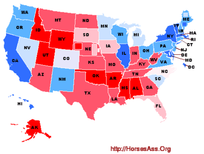
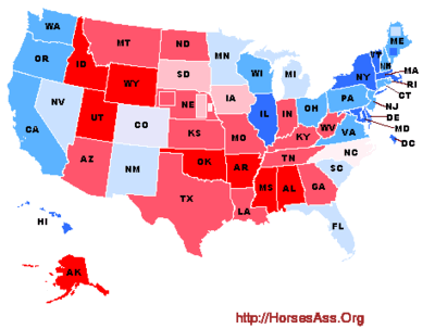
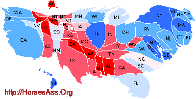
Poll Analysis: More Ryan bump
| Obama | Romney |
| 99.2% probability of winning | 0.8% probability of winning |
| Mean of 308 electoral votes | Mean of 230 electoral votes |
The previous analysis showed President Barack Obama leading Mitt Romney by a mean of 325 to 213 electoral votes. In an election held then, we would have expected Obama to win with a 99.8% and Romney with a 0.2% probability.
In the last two days there have been a plethora of polls released—16 covering 13 states. Here’s what I’ve found:
| start | end | sample | % | % | % | |||
|---|---|---|---|---|---|---|---|---|
| st | poll | date | date | size | MOE | O | R | diff |
| CT | Rasmussen | 21-Aug | 21-Aug | 500 | 4.5 | 51 | 43 | O+8 |
| FL | Quinnipiac | 15-Aug | 21-Aug | 1241 | 3.0 | 49 | 46 | O+3 |
| FL | Foster McCollum White | 17-Aug | 17-Aug | 1503 | 2.5 | 39.1 | 53.3 | R+14.3 |
| GA | 20/20 Insight | 15-Aug | 18-Aug | 1158 | 2.9 | 44 | 47 | R+3 |
| MA | PPP | 16-Aug | 19-Aug | 1115 | 2.9 | 55 | 39 | O+16 |
| MI | Glengariff Group | 18-Aug | 20-Aug | 600 | 4.0 | 47.5 | 42.0 | O+5.5 |
| MO | PPP | 20-Aug | 20-Aug | 500 | 4.4 | 42 | 52 | R+10 |
| MT | Rasmussen | 20-Aug | 20-Aug | 500 | 4.5 | 38 | 55 | R+17 |
| NV | SurveyUSA | 16-Aug | 21-Aug | 869 | 3.4 | 47 | 45 | O+2 |
| NM | Rasmussen | 21-Aug | 21-Aug | 500 | 4.5 | 52 | 38 | O+14 |
| OH | Ohio Poll | 16-Aug | 21-Aug | 847 | 3.4 | 49 | 46 | O+3 |
| OH | Quinnipiac | 15-Aug | 21-Aug | 1253 | 3.0 | 50 | 44 | O+6 |
| PA | Muhlenberg | 20-Aug | 22-Aug | 422 | 5.0 | 49 | 40 | O+9 |
| VT | Castleton Poll | 11-Aug | 21-Aug | 477 | — | 62 | 25 | O+37 |
| WI | Quinnipiac | 15-Aug | 21-Aug | 1190 | 3.0 | 49 | 47 | O+2 |
| WI | Marquette | 16-Aug | 19-Aug | 576 | 4.2 | 49.8 | 44.3 | O+5.5 |
The unsurprising Obama polls are from Vermont, Massachusetts, and Connecticut. Likewise, Romney makes a strong showing in Montana and Missouri.
Romney makes a surprisingly weak +3% showing in Georgia, where he has been typically been doing high single digit or double digit leads.
There is a big surprise in Florida. A Quinnipiac poll gives Obama a +3% edge over Romney. That’s not the surprise. A second poll by Foster McCollum White has Romney up by an amazing (unbelievable?) +14%. This poll requires some discussion.
This poll has triggered a lot of chatter among poll collectors. Is it real? Is it honest? Is it an “outlier.” One of the thing I noticed is that the raw tallies in the poll add up to more than 100%—102.13%, to be exact!
I went to the source; I had a chat with the firm’s pollster Eric Foster. Eric was friendly and most helpful. The poll is not sponsored by anyone. Rather, they firm did the poll on their own, as a way to get their feet wet in Florida (so to speak). It is an independent poll. I asked about the percentages summing to greater than 100%, he suggested this is a result of their weighting. I proposed renormalizing the numbers to proportionately reduce them to 100%, and he agreed this was a good strategy.
We then had a discussion about their weighting method. They went to each county to get voter turn-out information by age group and race/ethnicity and used that to weigh the poll (some of the details were lost in our lousy cell phone to cell phone connection). He stands by the numbers.
In other words, a polling firm that is new to Florida used an elaborate and unorthodox turnout model to weight the poll, and ended up with some kind of error that resulted in percentages totaling greater than 100%. I cannot say that I am convinced that what they have done was done correctly. Even so, it meets my poll criteria and it could be correct. (They’ll look like geniuses if Florida goes double digits for Romney!) So I include it here, and recognize that Florida will be reddish for the next month. But Georgia is not quite red enough and we still need a new poll in South Carolina! That’s the way the polls roll.
Earlier this week two polls in Michigan split between the candidates. The new poll swings back in Obama’s favor (+5.5%).
Nevada has Obama up by a fragile +2%, but Obama has maintained the edge since the start of the year:

New Mexico loves Obama, giving him a +14% lead over Romney this poll.
Two new Ohio polls both go for Obama by +3% and +6%. Likewise, Pennsylvania seems to prefer Obama over Romney by +9%.
Finally, Ryan may have had a small effect on Wisconsin, where Obama scored a +2% in one poll and +5.5% in another. The race has certainly tightened but a lasting effect is not obvious based on these newest polls:

Today, after 100,000 simulated elections, Obama wins 99,173 times and Romney wins 827 times (including the 175 ties). Obama receives (on average) 308 (-17) to Romney’s 230 (+17) electoral votes. In an election held now, Obama would be expected to win with a 99.2% (-0.6%) probability; Romney would have about a 0.8% (+0.6%) probability of winning.
Open Thread 8/23
– Todd Akin is the logical conclusion of flattering people like Todd Akin for 30 years.
– You would think Tim Eyman would learn something after the biggest lie of his life. But no.
– Jay Inslee releases his tax returns.
– I was afraid for over 60 years and those 60 years were wasted
– If you must fact-check, develop a cutesy scale that talks down to your audience.
Go Fuck Yourself
Following Todd Akin is a Jackass Gate, Josh Feit did an interview with US Senate candidate Michael Baumgartner. Then Baumgartner decided he wanted to talk about Afghanistan, but Feit still asked him questions about his positions on abortion and wrote about those extremist positions. Then, I guess because Feit’s focus, Baumgartner emailed him to “go fuck yourself” and has been digging himself deeper since. Now look, as someone who has been protesting the war in Afghanistan for over a decade, I’m sympathetic to complaints that the media do a bad job covering it. And I agree that Cantwell hasn’t been particularly good on war issues. And Christ knows there are times when Josh Feit has written stupid things and completely missed the mark.
But you know what, you don’t get to chose what the media write about. The best way to get better coverage of war issues is to be more compelling on those issues. And you really don’t have a leg to stand on when the media are responding to your press release.
Further, you don’t get to call a truce on social issues if you’re still planning to vote to force a woman to carry her rapist’s baby to term, or to force women — and other people who can become pregnant — to have to have all the medical problems that can go along with pregnancy and child birth. When you’re still planning to vote with the extreme elements of the forced pregnancy wing of the party, you haven’t actually declared a truce, and people are still going to talk about that.
Buses Versus Cars
Over at Publicola, Erica C. Barnett takes the piss out of this King 5 report.
But first, KING offers viewers a lesson in transportation taxonomy. Specifically: Cars are “traffic”; transit is not.
“Here on Alaska, two traffic lanes have been taken away and turned into bus-only lanes,” reporter Natasha Ryan intones, gesturing—with no apparent irony—at the completely empty street behind her. (Screen shot above). “Residents say there already aren’t enough parking spots. … Now residents fear that once the RapidRide stops that are already in place here on Alaska actually start service it’s going to mean even less parking.”
Got that? Bus-only lanes “take away” lanes from the streets’ rightful users—single-occupant cars.
This is fine as far as it goes, but it got me thinking: it’s yet another TV report that assumes its viewers are drivers. I assume a majority of its viewers are drivers as a majority of the people in the region are drivers. But plenty of their viewers must take the bus, as the bus is regularly quite crowed.
A while ago, I wrote that I was always surprised when newspapers aren’t the biggest advocates of public transit. Since we’re getting to an era when TV news can be watched on the bus (but still not in the car, hopefully), I wonder if maybe the knee jerk anti-transit stuff will come to an end. But I won’t think it’ll come any time soon.
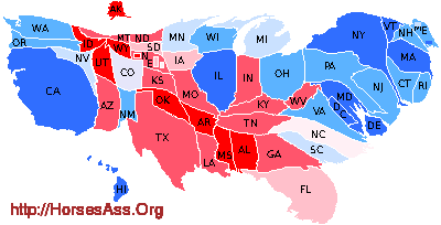
Poll Analysis: The Ryan Bump!
| Obama | Romney |
| 99.8% probability of winning | 0.2% probability of winning |
| Mean of 325 electoral votes | Mean of 213 electoral votes |
It’s been ten days since Mitt Romney announced his running mate. Polling has been a little on the slow side since then, but we now have 15 new polls in nine states to throw into the mix. Most of the polls have been taken since the August 11 announcement.
The previous analysis showed President Barack Obama leading Romney by a mean of 334 electoral votes to Romney’s mean of 204 electoral votes. An election held then was nearly 100% certain to go to Obama.
Here are the new polls:
| start | end | sample | % | % | % | |||
|---|---|---|---|---|---|---|---|---|
| st | poll | date | date | size | MOE | O | R | diff |
| CO | Purple Poll | 13-Aug | 14-Aug | 600 | 4.0 | 49 | 46 | O+3 |
| FL | Gravis Marketing | 20-Aug | 20-Aug | 728 | 3.8 | 45.1 | 48.3 | R+3.2 |
| FL | Rasmussen | 15-Aug | 15-Aug | 500 | 4.5 | 43 | 45 | R+2 |
| FL | Purple Poll | 13-Aug | 14-Aug | 600 | 4.0 | 47 | 48 | R+1 |
| MI | Baydoun | 16-Aug | 16-Aug | 1733 | 2.3 | 43.9 | 47.7 | R+3.8 |
| MI | Mitchell | 13-Aug | 13-Aug | 1079 | 3.0 | 49 | 44 | O+5 |
| MO | Chilenski Strategies | 08-Aug | 08-Aug | 663 | 3.8 | 47 | 48 | R+1 |
| NY | Siena | 14-Aug | 19-Aug | 671 | 3.8 | 62 | 33 | O+29 |
| OH | Purple Poll | 13-Aug | 14-Aug | 600 | 4.0 | 44 | 46 | R+2 |
| OK | SoonerPoll | 26-Jul | 14-Aug | 495 | — | 29 | 58 | R+29 |
| VA | PPP | 16-Aug | 19-Aug | 855 | 3.4 | 50 | 45 | O+5 |
| VA | Purple Poll | 13-Aug | 14-Aug | 600 | 4.0 | 45 | 48 | R+3 |
| WI | PPP | 16-Aug | 19-Aug | 1308 | 2.7 | 47 | 48 | R+1 |
| WI | Rasmussen | 15-Aug | 15-Aug | 500 | 4.5 | 47 | 48 | R+1 |
| WI | CNN/Opinion Research | 13-Aug | 14-Aug | 920 | 3.0 | 49 | 45 | O+4 |
Colorado gives Obama a +3% lead, and a winning streak of three August polls.
Romney takes all three Florida polls, matching Obama’s streak of three from the previous round. Overall, the past month of polls favor Obama with a 68% probability of winning the state. Of course, the pre-Ryan polls likely overestimate Obama’s chances.
Michigan puts Romney over Obama by a delicate +3.8% in one poll and Obama over Romney by 5% in another. The six current polls suggest Obama would win with a 90% probability right now.
The Missouri poll is pre-Ryan, and shows Romney with a slender +1% lead. In fact, a newer SurveyUSA poll that I mentioned in the previous analysis had Romney leading by slightly more (+1.9%).
No sign of a Ryan bump in New York, where Obama leads by +29%
We only have one new Ohio poll and that goes to Romney by +2%. The six current Ohio polls, taken together, give Obama a 98% probability of winning an election held now.
Oklahoma gives Obama a little bump. Romney’s +29% in the current poll was a +35% in May, when the last Sooner Poll was taken.
In Virginia, Obama leads Romney by +5% in one poll and Romney leads Obama by +3% in another. Obama leads in four of the five current polls and would be expected to win now with a 91% probability.
Will Ryan convince Wisconsin voters to support Romny? Three polls address this: Romney is up by a slim +1% in two polls and Obama is up by 4% in the third. Overall, Obama still wins the state by 97%.
A Monte Carlo analysis using 100,000 simulated elections finds Obama winning 99,771 times and Romney winning 229 times (including the 16 ties). Obama receives (on average) 325 (-9) to Romney’s 213 (+9) electoral votes. The results suggests that Obama would win and election held now with a 99.8% (-0.2%) probability and Romney would win with a 0.2% probability.
Empirically, the selection of a running mate tens to strengthen a candidate’s chances. Usually the bump are transient—that is, VP selection results in a temporary “bounce.” Here what we see is a small bump up some ten days after the announcement.
Since the analysis also includes numerous polls taken prior to the Ryan selection, we should expect Romney’s prospects to improve as the pre-Ryan polls “age out” of the analysis. Whether the bump persists or becomes a bounce is still unclear.
Here is the distribution of electoral votes [FAQ] from the simulations:
[Read more…]
Drinking Liberally — Seattle
![]() Please join us tonight for an evening of politics and conversation over a pint at the Seattle Chapter of Drinking Liberally.
Please join us tonight for an evening of politics and conversation over a pint at the Seattle Chapter of Drinking Liberally.
We meet every Tuesday at the Montlake Ale House, 2307 24th Avenue E. Starting time is 8:00pm. Some people show up earlier for Dinner.
Special Event: On Sunday, Sept 9th, Comedian Dean Obeidallah will bring his progressive political stand up show to Seattle. Here’s the information:
Dean Obeidallah for Vice President Comedy Tour in Seattle on Sunday, September 9
A night of stand up comedy featuring award winning comedian Dean Obeidallah.
The San Francisco Weekly wrote: “Dean Obeidallah is a gruff-voiced, shoot-from-the-hip New Yorker…fresh and clever.”
The Washington Post called Dean: “an angsty Arab Chris Rock.”
Dean Obeidallah has appeared on numerous US and international TV shows including Comedy Central’s “Axis of Evil” special, ABC’s “The View,” “Comics Unleashed,” NBC’s “Rock Center,” MSNBC’s “Up with Chris Hayes,” Current TV’s “The Young Turks,” and can be seen weekly on CNN offering comedic commentary on political and topical issues. He also writes weekly opinion articles for CNN.com.
He is co-director/co-star of the soon to be released documentary “The Muslims Are Coming!” which also features The Daily Show’s Jon Stewart, MSNBC’s Rachel Maddow, comedians Lewis Black, David Cross, Maz Jobrani, Janeane Garofalo, Colin Quinn and more. Official Trailer is here.
Special guests for the show:
Khaled the Comic – Based in Chicago, Khaled has performed at comedy clubs all over the US and Canada. He was featured in the Best of the festival show in the 2011 NY Arab-American Comedy Festival.
Melissa Shoshahi – One of the top Iranian-American comedians in the country. Melissa has performed in venues across the US bringing her witty personality to the stage and knows no limits when it comes to comedy-discussing thoughts on her perspective on life to her unique upbringing into society. Her edgy comedy can be best described as ‘beautiful, so beautiful’ by her mother.
Sunday, September 9, 2012 at 8:00PM
SCCC Broadway Performance Hall
1625 Broadway
Seattle, WA 98122
United StatesTickets: $25
Student tickets $15 at the door with valid student IDFor tickets please visit: Brown Paper Tickets or call 800-838-3006
Here is Dean in his Comedy Central “Axis of Evil” Comedy special:
Can’t make it to Seattle’s DL tonight? Check out one of the other DL meetings over the next week. The Tri-Cities chapter meets tonight, the Burien chapter meets on Wednesday, and the Woodinville chapter meets on Thursday.
With 233 chapters of Living Liberally, including thirteen in Washington state four in Oregon and three more in Idaho, chances are excellent there’s a chapter near you.
Open Thread 8/21
– I love the fact that The Stranger are trying to bring down Frank Chopp with a Socialist candidate.
– This is the best headline I’ve seen in a while.
I coulda told you that!
Money Magazine came out with its list of America’s [100] best small cities.
Number five on the list: My home town of Redmond, WA. Well deserved, if I do say so. Here’s a KOMO-TV report on it.
The next best Washington small city on the list is Bellevue at #40.
The snapshot for Bellevue mentions, “Traffic into Seattle is a perpetual snarl,” but that “a light-rail line that will connect Bellevue and Seattle is in the works.”
Huh…imagine that. The light rail from Seattle to Bellevue isn’t even built yet. Just having it planned is adding value to Bellevue.
Suck on that, Rob McKenna!
- « Previous Page
- 1
- …
- 340
- 341
- 342
- 343
- 344
- …
- 1041
- Next Page »